

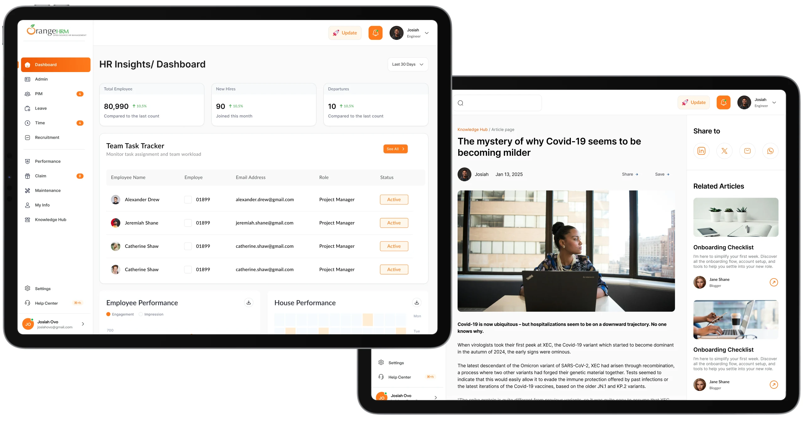
 Orange HRM
HRM Dashboard Design • 2025
Redesigning Orange HRM Dashboard: Driving Growth And Responsiveness.
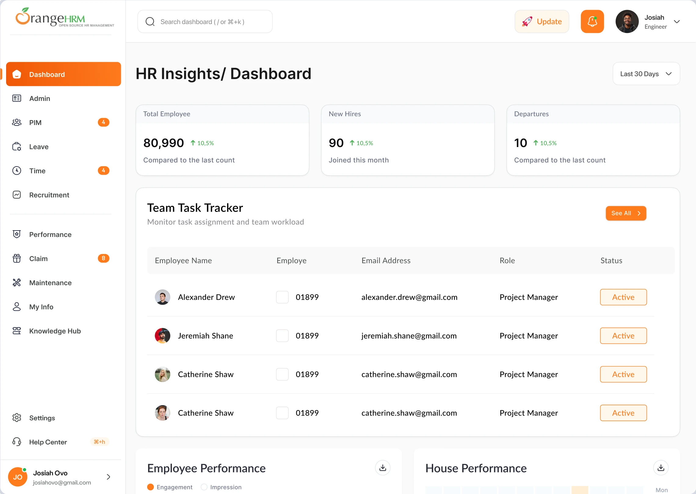
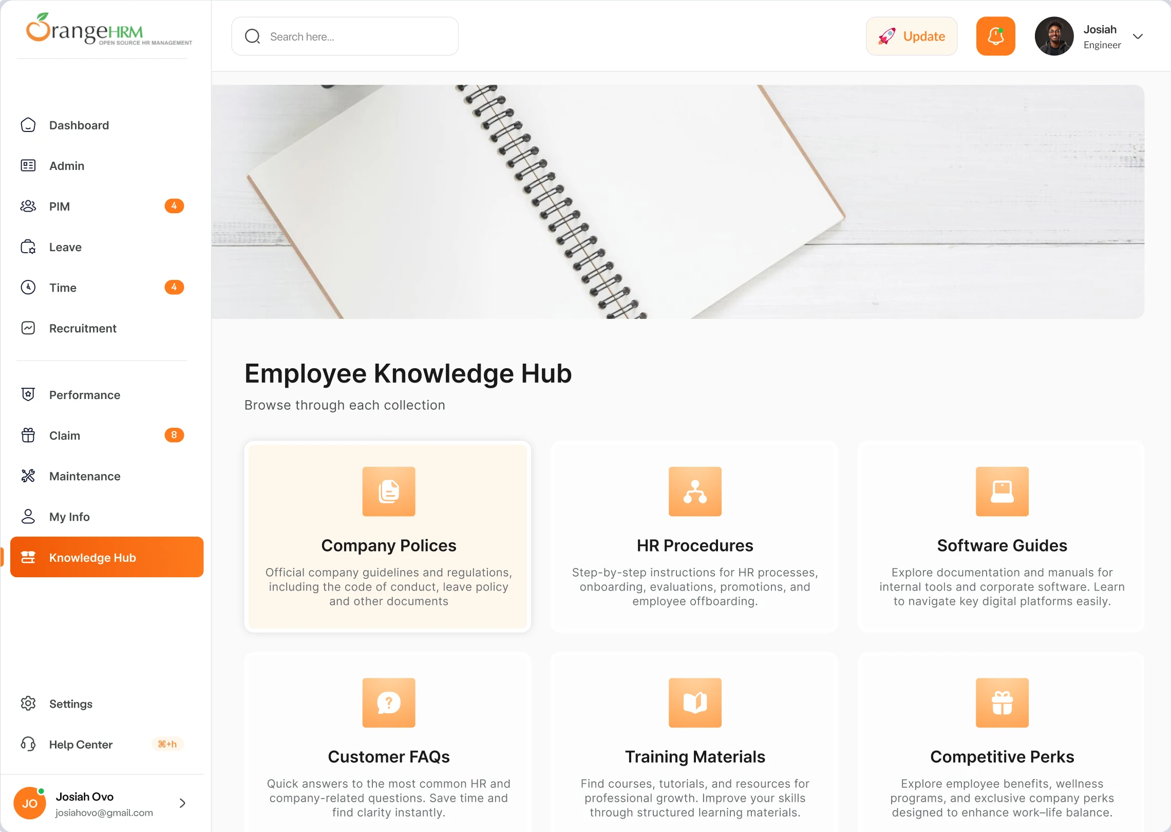
Orange HRM is a HR software that simplifies your workflow, empowering your team and unlocking the potential of your people, from hiring to thriving. The existing dashboard experience was cluttered, visually noisy, and lacked hierarchy, making it difficult for HR managers and employees to quickly understand what needed their attention. My goal was to redesign the dashboard and knowledge hub into a cleaner, more human-centered experience, enabling users to access key information faster and complete tasks without friction.
THE PROBLEM
Based on the 10 user interviews and 18 user surveys, these were the problems and issues users encountered while making use of the dashboard
THE SOLUTION
Based on the 10 user interviews and 18 user surveys, these were the problems and issues users encountered while making use of the dashboard

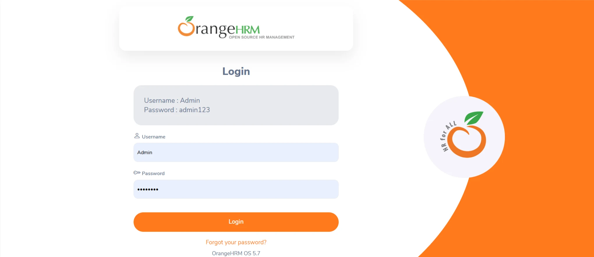
Orange HRM old screens

The Design Process
Analysis
- User Personas
- Functional Analysis
Research
- User Flow
- Information Architecture
- User Interviews
- Competitor Analysis
Prototyping
- Service Structure
- Wireframes (Low-fidelity)
- Functional Prototype
- Technical Specialization
Design
- Visual Concept
- Design System
- App Icon
- High-Fidelity UI
Test
- Interactive Prototype
- Animation
- Main flow Testing
- Specification for a Developer
USER INTERVIEWS
I interviewed 3 HR who currently use Orange HRM. This helped me gain an in depth understanding of the participants’ behaviors and habits when they’re shopping either in person or online so I’m able to find effective ways to help fill their needs and achieve their goals.
“The current website feels overwhelming because they have too much information that’s not in the right order.”- Jewel (Participant)
USER PERSONA
Based on the user Interviews, I came up with a user persona that captures the users frustrations, needs and goals when it comes to Orange HRM Dashboard.

Occupation: HR Manager
Location: Kyiv
Sarah oversees employee records, recruitment, attendance tracking, performance reviews, and HR reporting. She spends several hours each day in the HRMS and needs quick access to critical information and her workflow involves switching between multiple modules throughout the day, often while handling urgent employee requests and management inquiries.
- Dashboard feels cluttered and overwhelming
- Navigation hierarchy is unclear
- Important actions are difficult to find quickly
- Frequently used tools require too many clicks
- Hard to identify urgent tasks at a glance
- Information density makes scanning difficult
- Quick access to frequently used HR functions
- Reduced time spent searching for features and faster access to employee information
- Easy task prioritization
- Spend more time supporting employees and less time navigating software
- Make faster, data-driven HR decisions
- Stay on top of recruitment and performance reviews
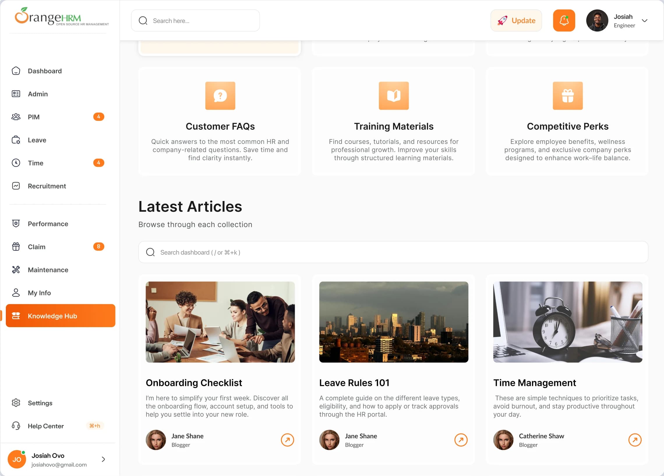
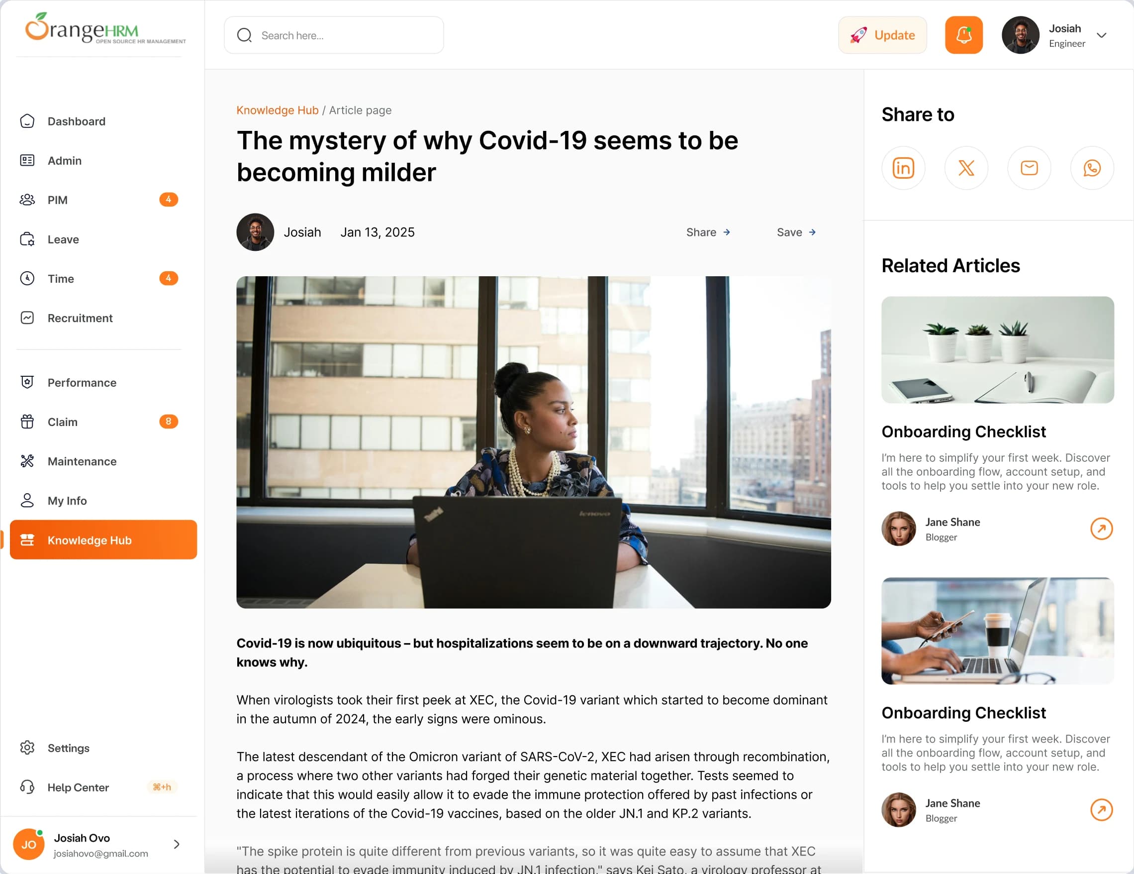
HIGH-FIDELITY WIREFRAMES
It’s important to stay true to the brands identity and values by staying consistent with the content and style throughout the website.
Conclusion
KEY TAKEAWAYS
Main Insights : Research revealed that users struggled to quickly locate key HR functions due to information overload and unclear content hierarchy. By focusing on usability, task prioritization, and accessibility, the redesigned dashboard creates a more intuitive experience that supports day-to-day HR operations.
Testing And Feedback : This redesign taught me the value of balancing business requirements with user needs. It demonstrated how thoughtful information architecture, clear visual hierarchy, and user-centered design principles can transform a complex system into an efficient and enjoyable experience.