

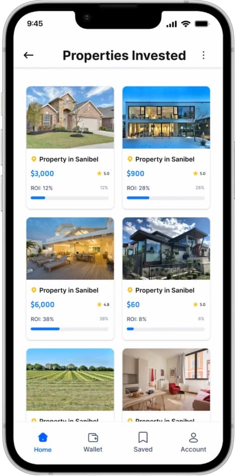
 KeyFund Real-Estate App
Real Estate Mobile App Design • 2025
An app that opens global real estate investing to everyone, no matter where they start.
As KeyFund is an AI-powered investment app that lets people in Africa, and anyone around the world with limited capital, invest in global real estate transparently and securely. By breaking down high-value properties into affordable, fractional shares, KeyFund turns an opportunity once reserved for the wealthy into something an everyday investor can access from their phone. The goal was to design an experience that removes the three biggest barriers to real estate investing, cost, trust, and knowledge, and replaces them with a simple, guided, and verifiable path to building wealth.
PROBLEM
Accessing high-value real estate investments remains difficult for some Africans due to high entry costs, leaving wealth-building opportunities out of reach for everyday investors. As a result, many people are unable to participate in assets that have traditionally helped generate long-term financial growth and stability. Trust concerns, investment risks, and limited financial knowledge often discourage participation. Without transparency, guidance, or confidence in opportunities, many potential investors remain on the sidelines.
SOLUTION
KeyFund makes real estate investing more accessible by allowing users to start with as little as $50 through fractional ownership. Instead of needing large amounts of capital to purchase entire properties, investors can own a share of high-value real estate and earn returns based on their investment. AI verifies every property through legal, financial, and market checks before listing, while built-in guidance helps investors evaluate opportunities, understand risks, and make informed decisions with confidence.
Analysis
- User Personas
- Functional Analysis
Research
- User Flow
- Information Architecture
- User Interviews
- Competitor Analysis
Prototyping
- Service Structure
- Wireframes (Low-fidelity)
- Functional Prototype
- Technical Specialization
Design
- Visual Concept
- Design System
- App Icon
- High-Fidelity UI
Test
- Interactive Prototype
- Animation
- Main flow Testing
- Specification for a Developer
Empathize
USER INTERVIEWS
My design research centered on understanding how everyday people perceive real estate investing — and why so many capable savers never start.
Define
USER PERSONA
By creating a user persona, I gained insight into the actual users’ needs, goals, and frustrations. Through empathy, I can provide a more meaningful user experience. The objective is to identify effective strategies to address the users’ needs and pain points, based on the user persona that has been created.

Occupation: Business Owner
Location: Port Harcourt
Chinedu owns a business and saves consistently, but his money mostly sits in a regular account losing value to inflation. He's heard real estate is one of the best ways to build wealth, but every option he's found needs capital he doesn't have, or feels like a risk he can't verify. He's smart and ambitious, but cautious with his money.
- High minimum investments lock him out.
- No idea how to evaluate a property or its risk.
- Fear of scams and hidden fees in cross-border deals.
- Existing platforms feel intimidating and jargon-heavy.
- See clear proof that properties and platforms are legitimate.
- Understand opportunities without needing a finance degree.
- Start investing with a small, manageable amount.
- Grow his savings into an asset that outpaces inflation.
- Track his money and returns in real time while building a portfolio gradually.
- "I want to grow my money into something real — but I need to trust where it’s going and actually understand what I’m doing."
Ideate
MID-FIDELITY WIREFRAMES
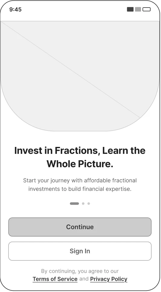
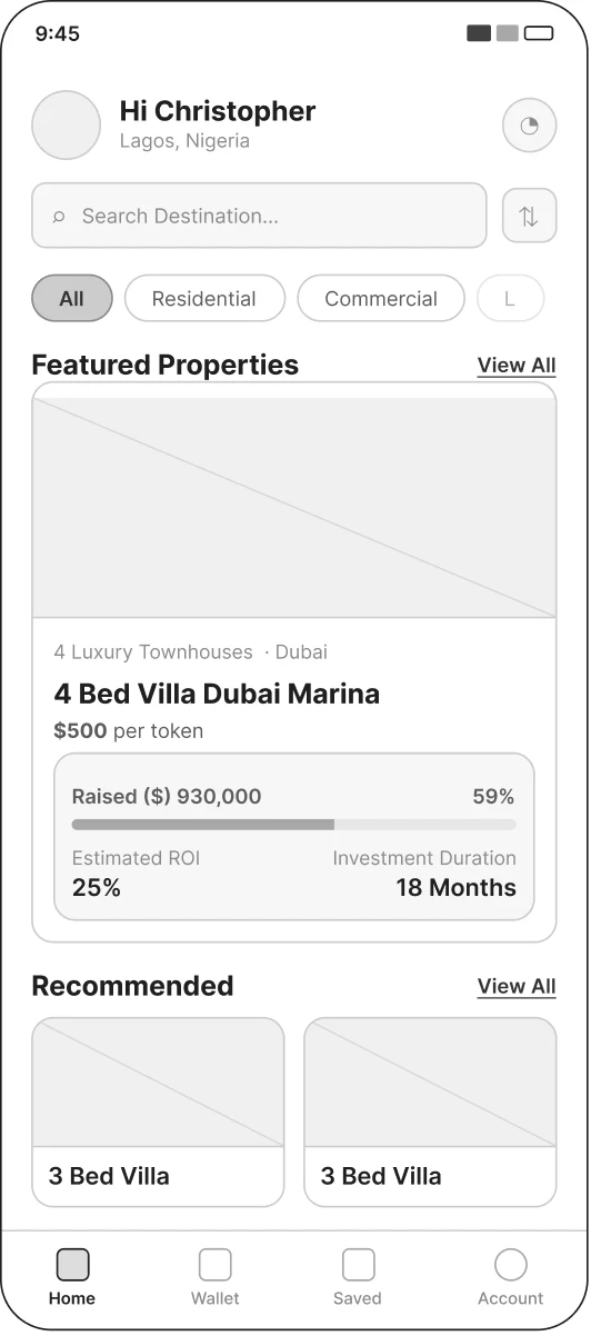
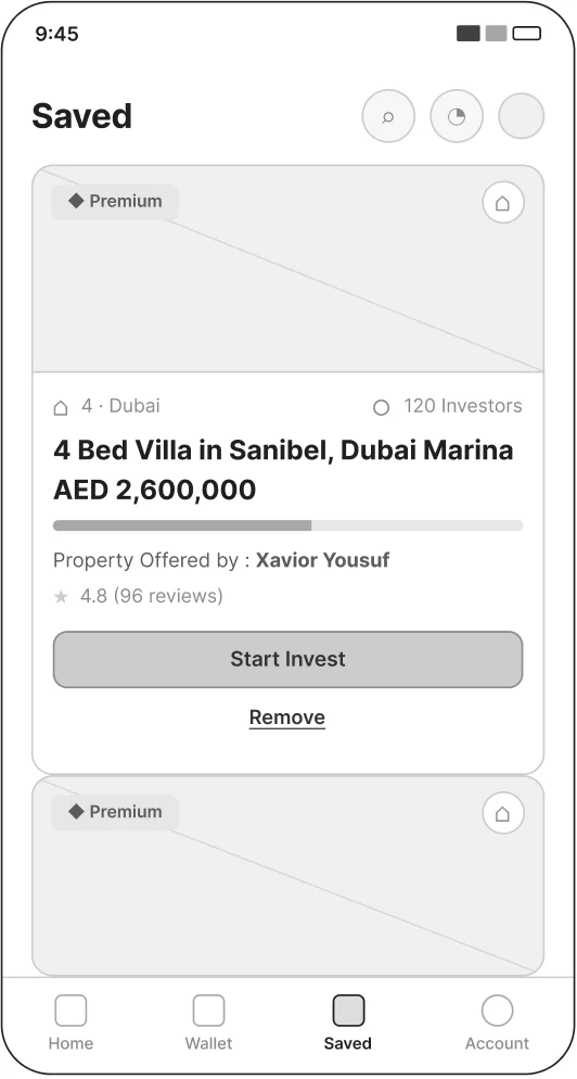
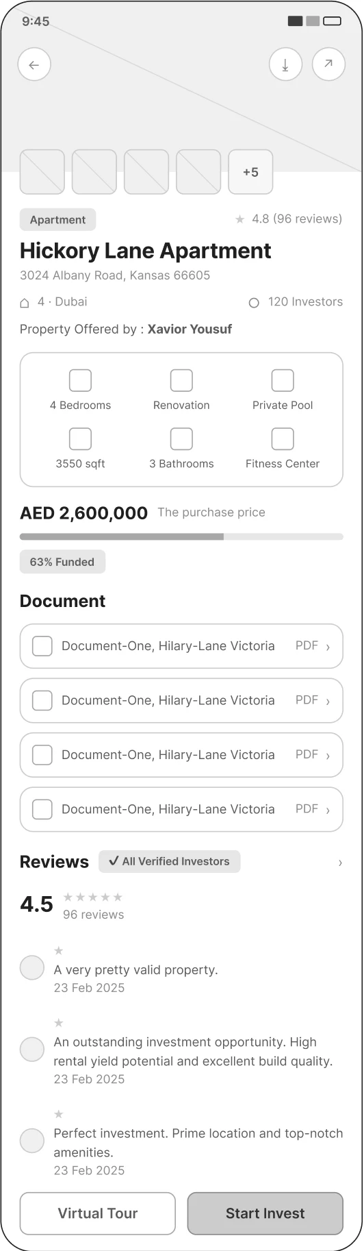
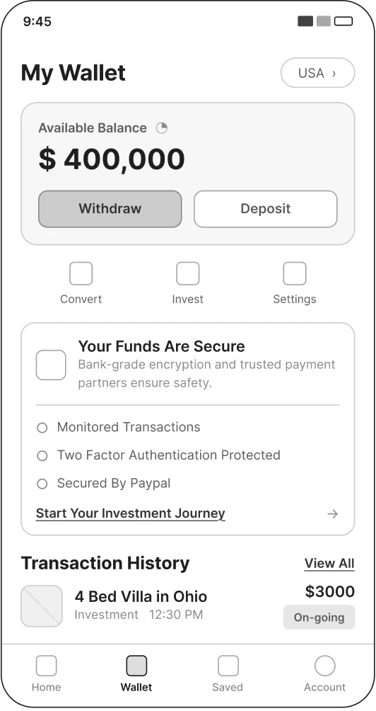
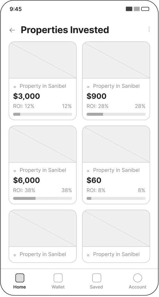
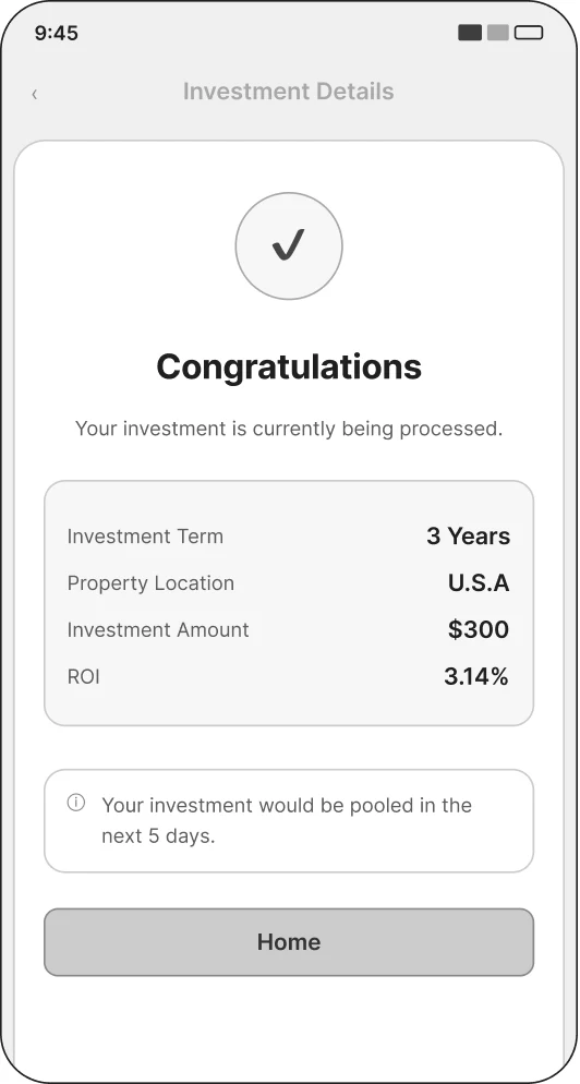
With mid-fidelity wireframes, I can concentrate on the layout and hierarchy without being distracted by aesthetic details. This stage is crucial for obtaining feedback and making modifications before moving forward.
HIGH-FIDELITY WIREFRAMES
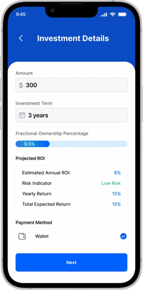
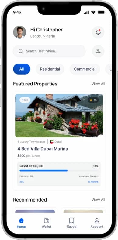
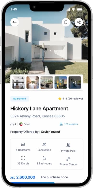
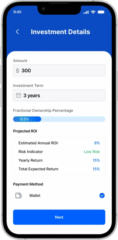
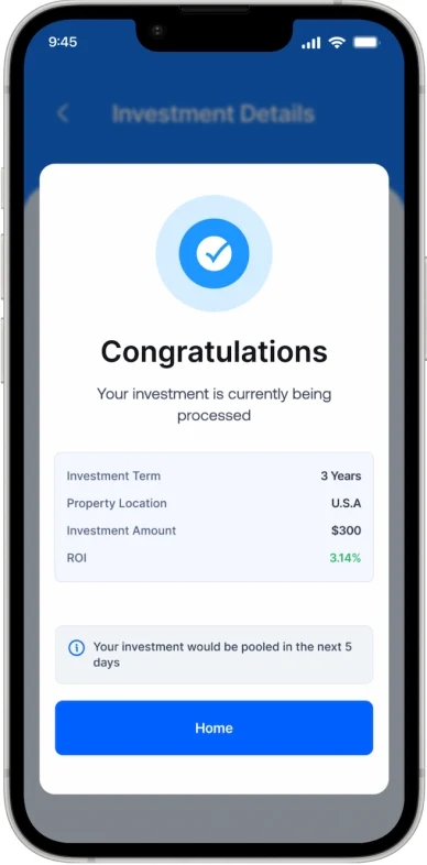
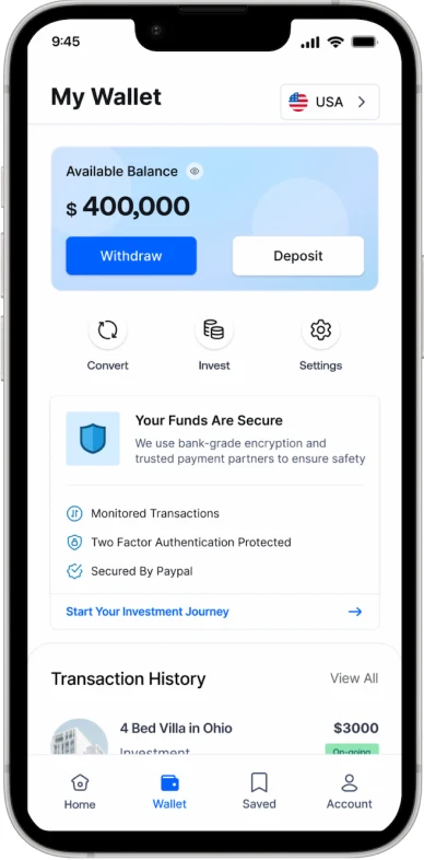
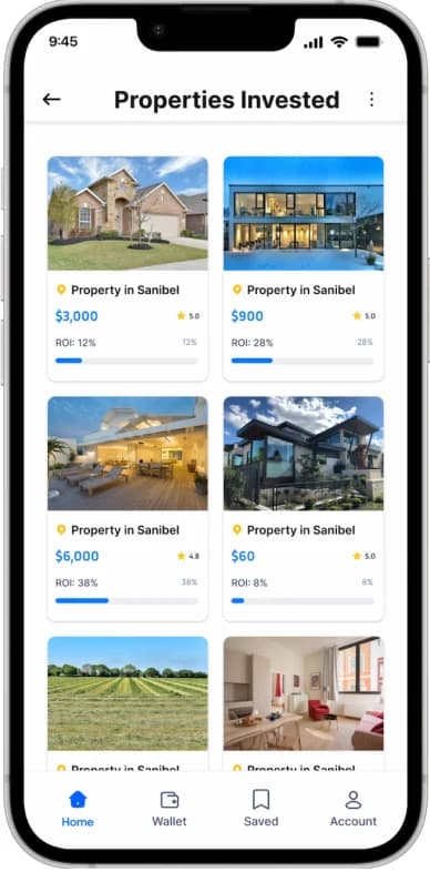
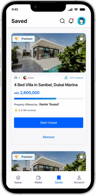
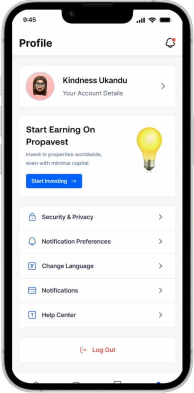
With the high-fidelity designs, I translated the structure into a clean, trustworthy interface. Because trust was the central challenge, the visual system leans on clarity: generous spacing, confident typography, verification badges, and real-time data shown openly. Every screen is designed to make a cautious user feel informed and in control.
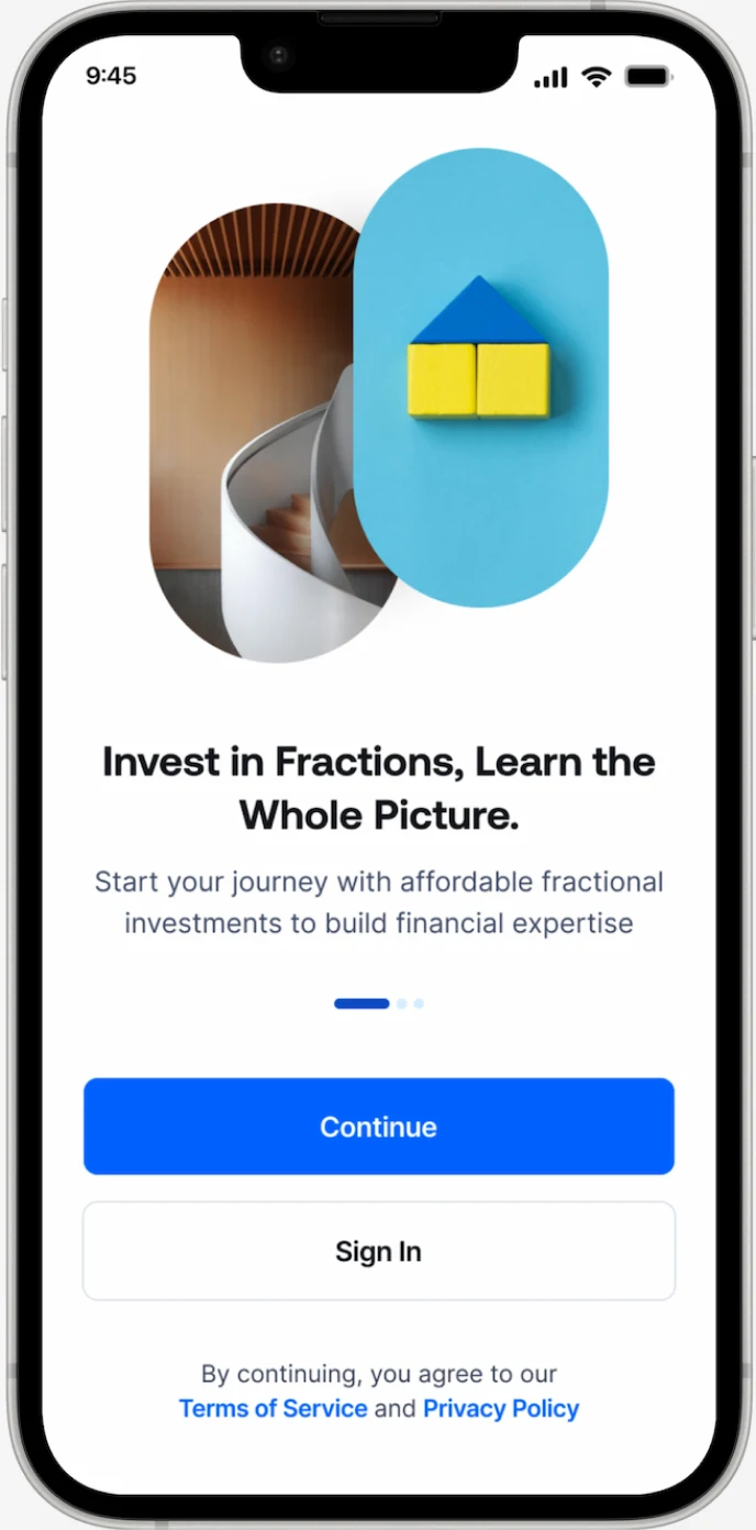
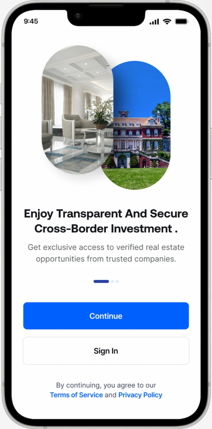
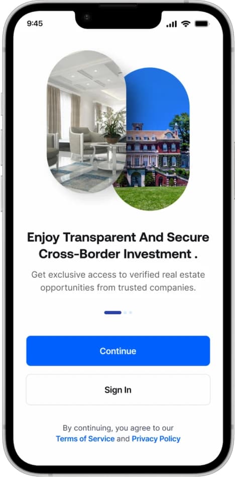
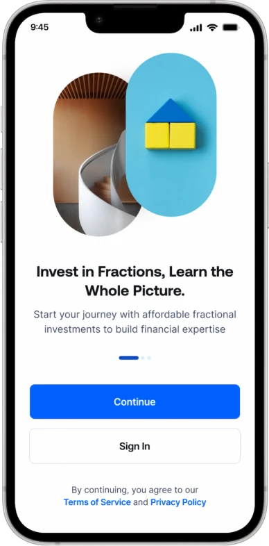
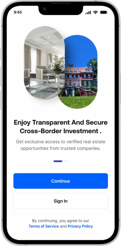
A short, friendly onboarding that explains fractional ownership in seconds and gets users to their first opportunity quickly, without overwhelming them.
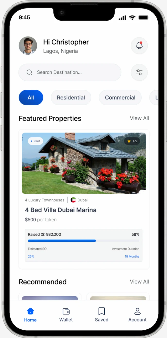
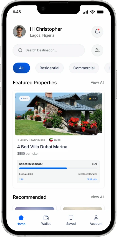
The home screen surfaces portfolio value, returns at a glance, and curated, verified opportunities, so users see both their progress and their next move.
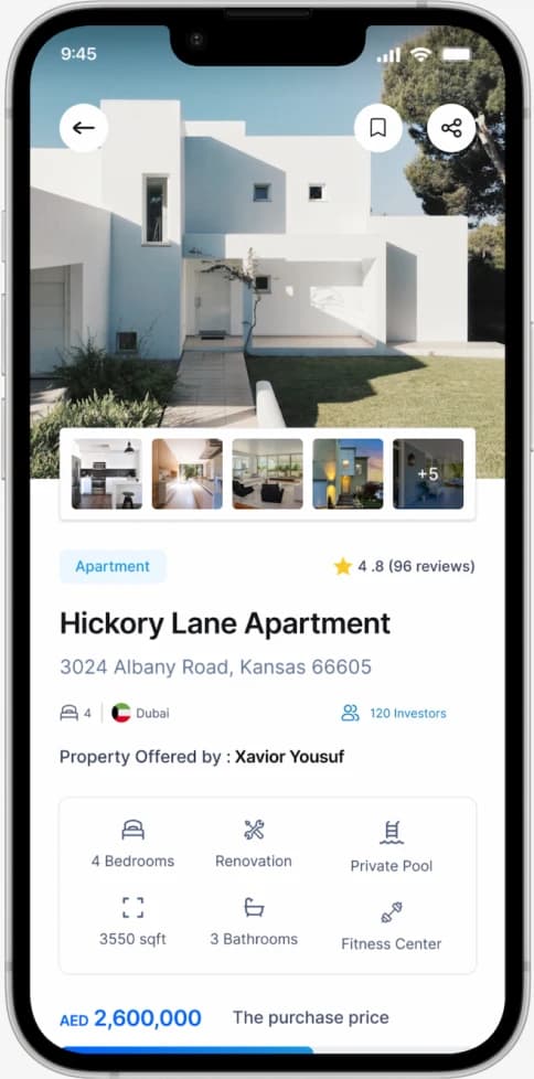
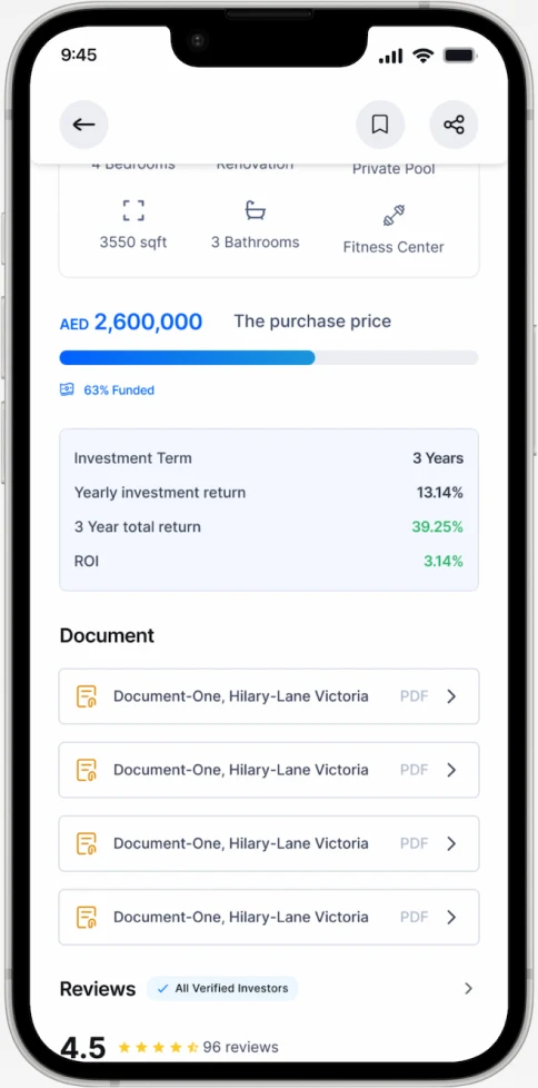
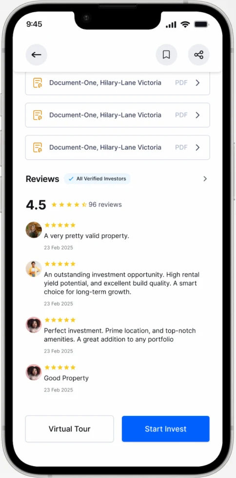
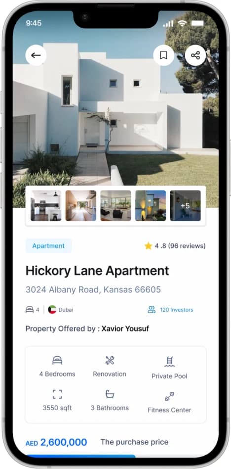
Each listing shows verification status, AI-generated risk and opportunity summaries, projected returns, and a transparent fee breakdown, all in plain language.
Conclusion
KEY TAKEAWAYS
Designing for trust is a feature : The biggest lesson from KeyFund was that trust is built by making verification, and fund movement visible at every decision point. Transparency had to be designed into the flow, not added on top.
Meeting users where their confidence is : Cautious, first-time investors need fewer unknowns. Plain-language guidance and AI explanations did more for adoption than any single screen, because they removed the fear that kept people from starting.
Accessibility means more than affordability : Lowering the entry point to $50 opened the door, but real accessibility meant pairing low cost with clarity and education so users could afford to invest and actually understand and trust what they were doing.