

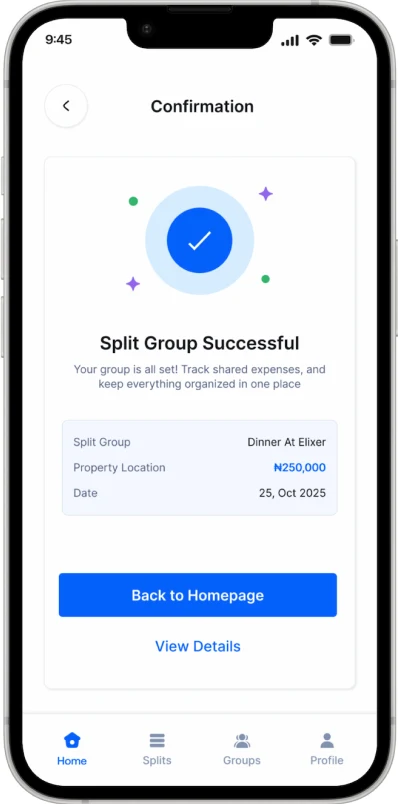
 E-Split Mobile App
Fintech Mobile App Design • 2024
An app designed to make sharing expenses among individuals simple, transparent, and stress-free.
This concept explores a digital feature that helps users divide group expenses, track who's paid, and send lighthearted reminders when payments are pending. Whether it's a dinner with friends, a group trip, or shared apartment bills, splitting costs can get messy, especially when it's time to remind someone who hasn't paid. The goal was to create a simple, user-friendly experience that fits naturally into the way people already interact within their groups, making financial activities feel as effortless as social ones.
PROBLEM
Splitting expenses among friends should be simple, yet it often becomes difficult to track who has paid, who still owes money, and what the remaining balance is. Users are left juggling chat messages, bank transfers, and manual calculations, creating unnecessary friction in what should be a straightforward process. Many existing bill-splitting solutions also fail to reflect local payment habits, forcing users to switch between multiple apps just to verify transactions and settle expenses.
SOLUTION
E-Split streamlines group expense management by providing a centralized space where users can split bills, track payments, and manage balances in real time. Automated reminders reduce the need for awkward follow-ups, while local payment integrations make it easier for users to pay and confirm transactions without leaving the app. The result is a simpler, more transparent experience that helps groups stay organized and settle expenses with less effort.
Empathize
USER INTERVIEWS
Interviews focused on understanding how people currently track shared expenses, where the process breaks down, and the emotional friction around asking others for money.
Define
USER PERSONA
By creating a user persona, I gained insight into the actual users’ needs, goals, and frustrations. Through empathy, I can provide a more meaningful user experience. The objective is to identify effective strategies to address the users’ needs and pain points, based on the user persona that has been created.

Occupation: Marketing Lead
Location: Abuja
Olamide is the unofficial treasurer of every group she belongs to, the trip planner, the dinner-bill collector, the one who fronts the cash and chases everyone afterward. She's comfortable with mobile apps but tired of doing the math and the chasing herself.
- Tracking who has paid and who still owes is messy.
- Awkward, repeated reminders strain friendships.
- Manual calculations are tedious and error-prone.
- Switching between chat, bank apps, and notes.
- No single shared view of a group’s balance.
- Local payment confirmation is hard to verify.
- Split bills quickly and fairly without manual calculations while being able to pay using local bank.
- Keep a clear, shared record of who has paid and who hasn’t.
- Send reminders without feeling like the "annoying" friend.
- A single, transparent space the whole group can see.
- Automated, friendly reminders that remove the social tension.
- Local payment integration to settle instantly to feel organized and in control without doing all the work.
Ideate
MID-FIDELITY WIREFRAMES
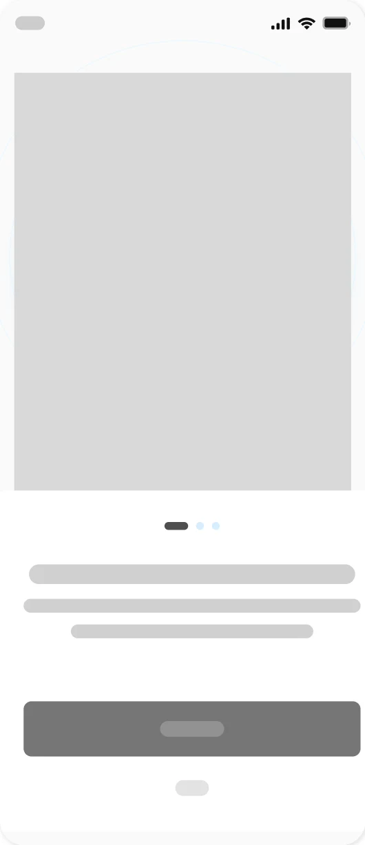
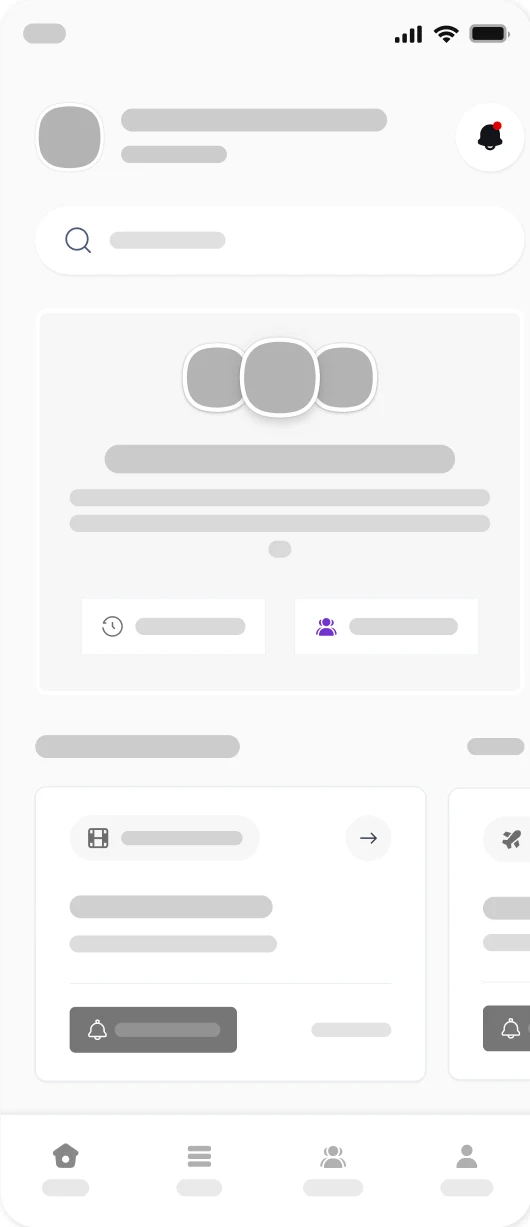
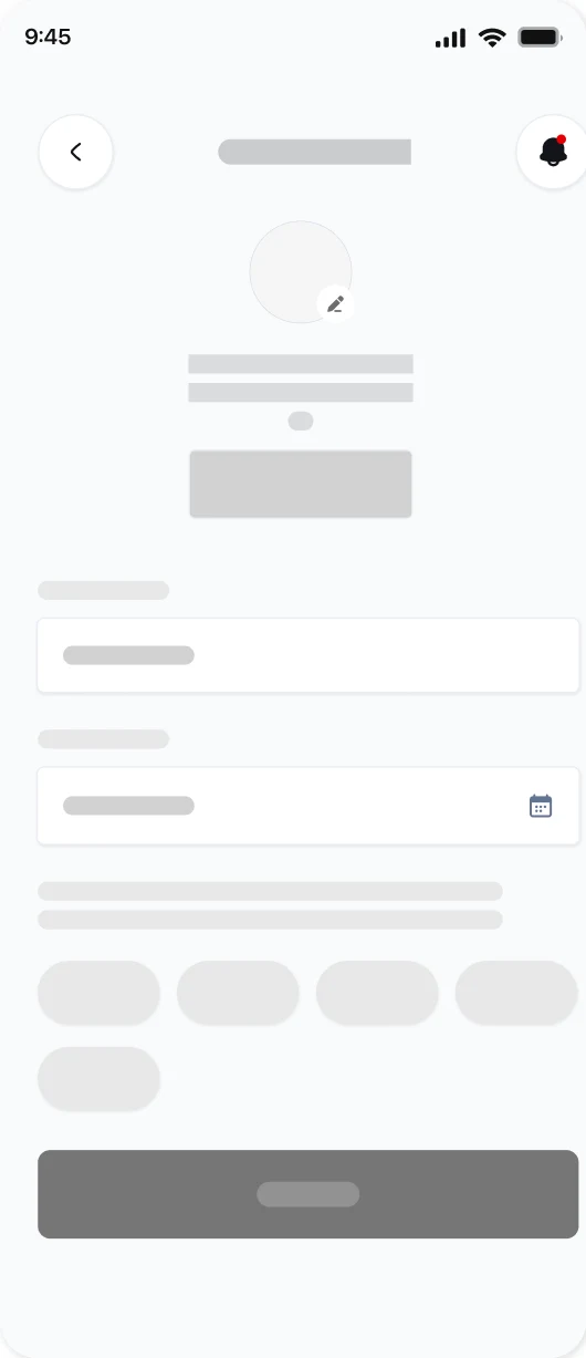
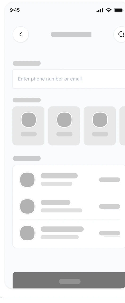
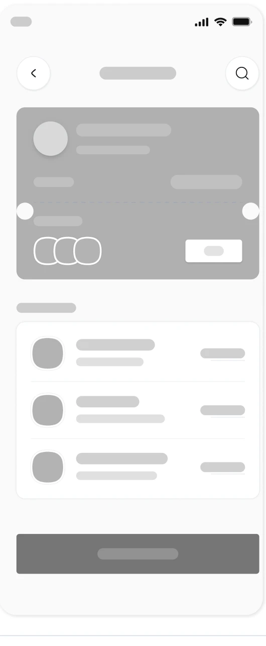
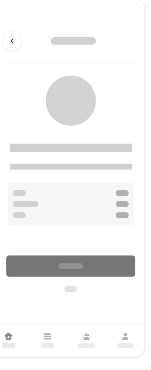
With mid-fidelity wireframes, I can concentrate on the layout and hierarchy without being distracted by aesthetic details. This stage is crucial for obtaining feedback and making modifications before moving forward.
HIGH-FIDELITY WIREFRAMES
With incorporating the design choices to the mid-fidelity wireframes, I’m able to see a clearer representation of the final product. It’s important to stay true to the brand’s identity and values by staying consistent with the content and style throughout the application. By creating these wireframes, I’m able to move forward with prototyping and effectively bring these designs to life.
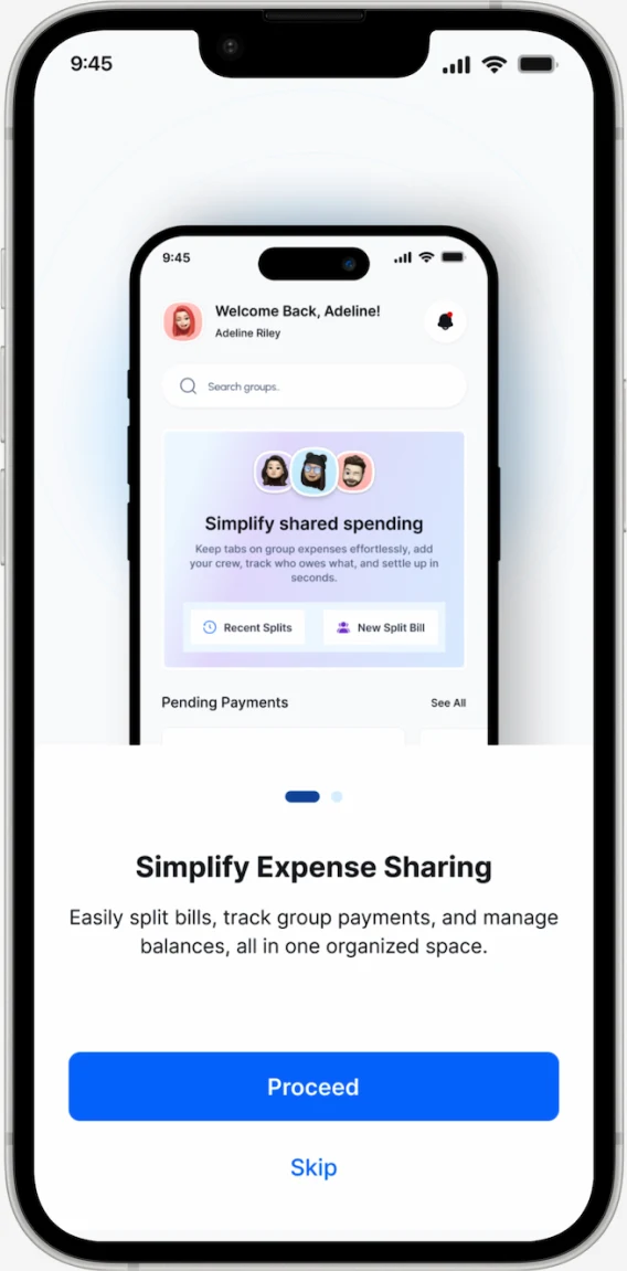
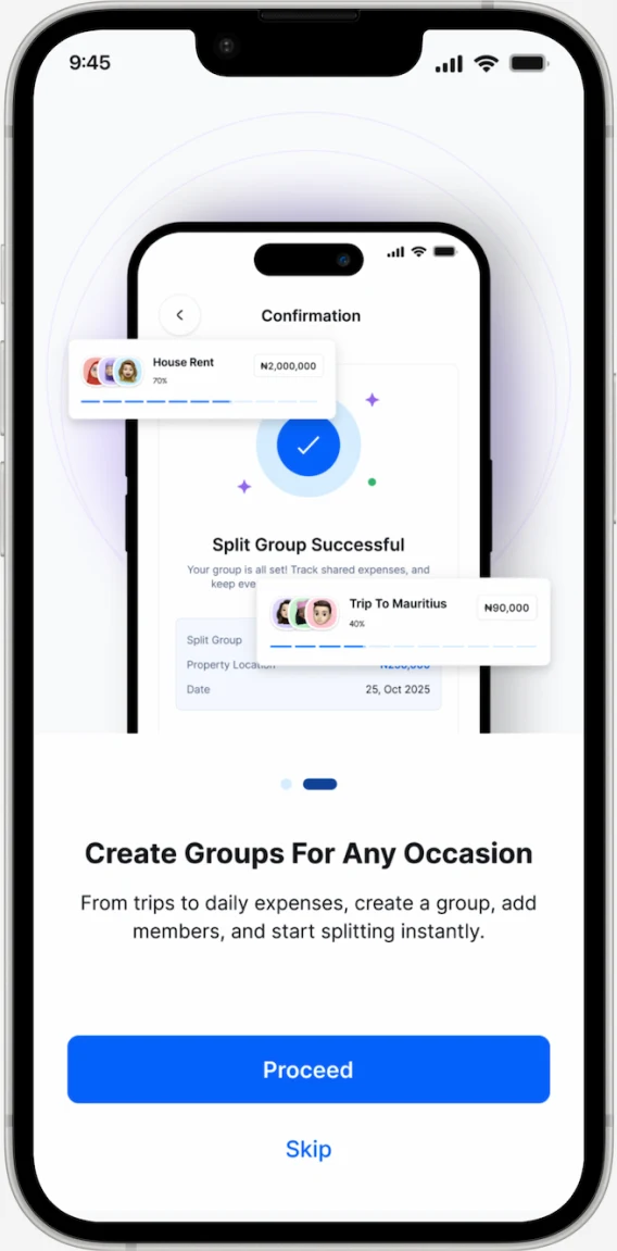
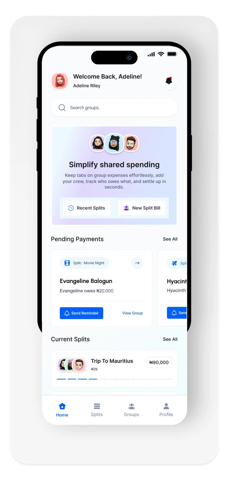
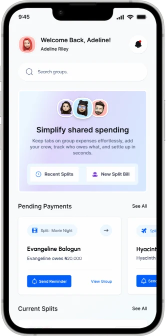
The Homepage serves as a user’s starting point. It displays pending payments, current group splits, and quick actions like “Split New Bill” or “Send Reminder.” The layout is designed for clarity. Users can instantly see what’s due, who they owe, and access their most active groups.
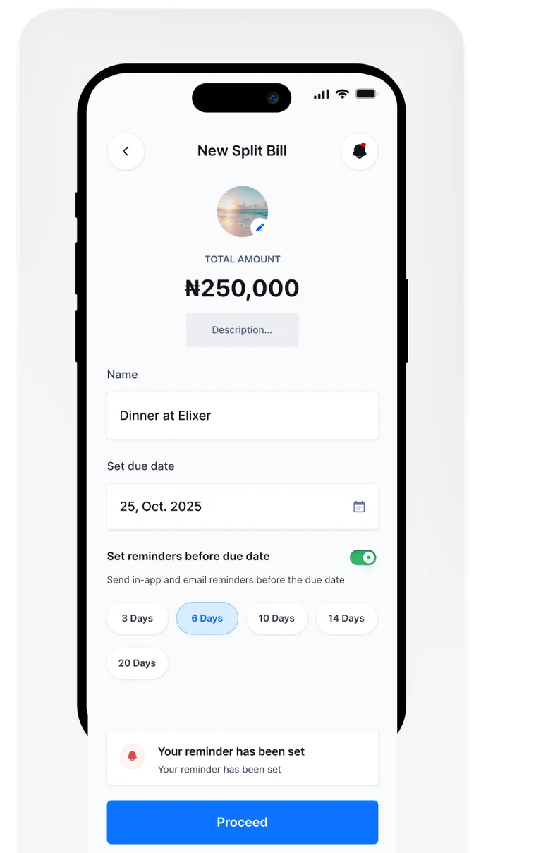
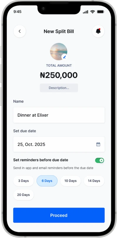
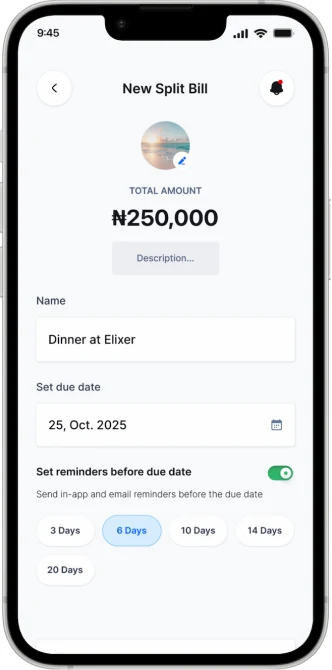
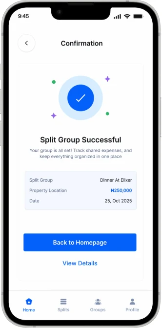
This screen allows users to create a new shared expense in seconds. They can enter the bill name, total amount, and set a due date. An integrated reminder option lets them schedule notifications ensuring payments aren’t forgotten.
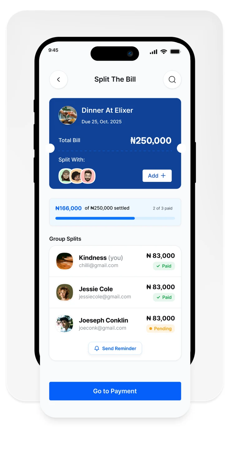
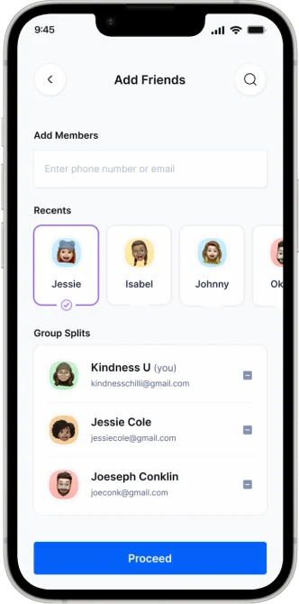
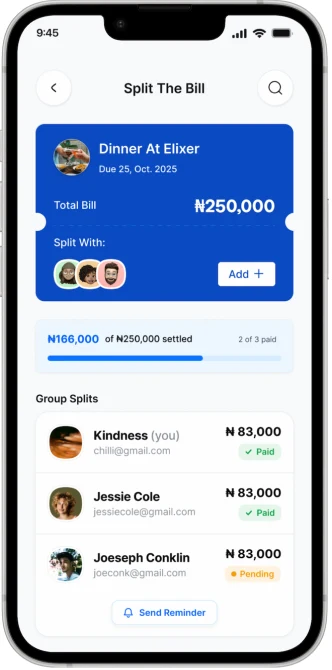
This screen shows how the total expense is divided among group members. Each person’s share and contact are clearly displayed for transparency. The event summary sits at the top, while a bold “Go to Payment” button guides users to confirm or complete their payment.

Test
The testing consisted of four participants, all of whom regularly split costs within friend groups or shared apartments. They were asked to create a new split bill from scratch, and then open an existing group split to check who had paid and send a reminder to anyone who hadn’t. The goal was to see how easily users navigated the core flow, gather feedback on the look, and functionality, and identify any points of confusion in the layout.
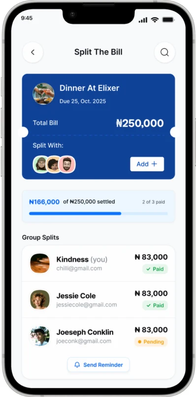
The main point of confusion appeared on the Split The Bill screen. Because every member displayed the same amount with no visual difference between someone who had already paid and someone who still owed, participants couldn’t tell at a glance where the group actually stood.

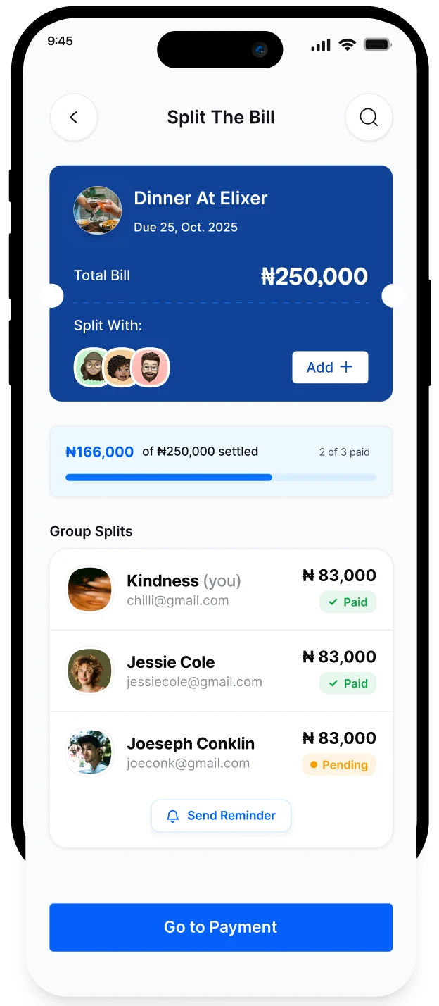
After making that change, each member now carries a clear “Paid” or “Pending” tag, and a settled-amount tracker, so users can instantly see where the group stands and send reminders only to those who still owe.
Conclusion
KEY TAKEAWAYS
Designing For Trust and Transparency : The biggest lesson from E-Split was that clarity isn’t a visual nicety, it’s the product. Every decision, from showing payment status at a glance to keeping a shared record everyone can see, came back to reducing doubt so groups could settle up without second-guessing one another.
Testing Reveals What Assumptions Hide : The Split The Bill screen looked complete until real users tried it and couldn’t tell who had actually paid. The takeaway is that early, honest testing isn’t a final checkbox, it’s how a design earns its way to done.
Meeting Users Where They Already Are : E-Split fit into how people already handle money and friendships, rather than asking them to change their habits. The best solution removes friction from existing behavior instead of inventing new behavior to learn.